Designing Mobile-First Websites for a Seamless Global Experience
In today’s digital age, mobile usage is no longer just an emerging trend—it’s the standard. With over 70% of global web traffic originating from mobile devices—and an even higher percentage in mobile-first nations like India—businesses must adopt a mobile-first approach to web design to stay competitive and deliver optimal user experiences.
Table of Contents
- Start Small, Think Big
- Prioritise Content Over Clutter
- Simplify Navigation
- Optimise for Speed and Efficiency
- Leverage Video Smartly
- Deliver a Consistent Cross-Platform Experience
- Conclusion

1. Start Small, Think Big
A mobile-first design process begins by creating layouts for the smallest screen sizes—typically smartphones. This ensures that core content and functionality are delivered with clarity, even in constrained environments. Once the mobile foundation is solid, it can be scaled up for tablets and desktops using responsive design techniques.
Designing this way enforces simplicity and usability. It encourages you to focus on what matters most—delivering a fast, efficient, and delightful experience regardless of the device.
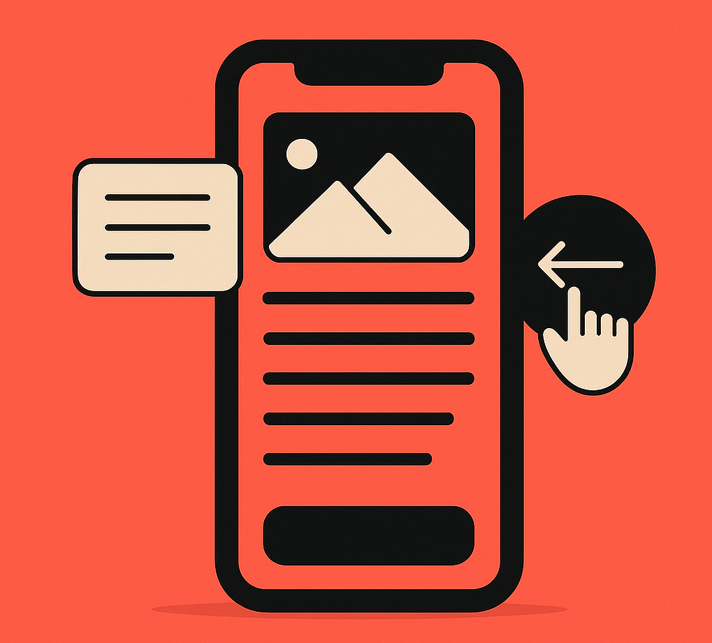
2. Prioritise Content Over Clutter
With limited space on mobile devices, it’s critical to prioritise meaningful content and remove distractions. Mobile users seek information fast. Your design should emphasize concise messaging, relevant visuals, and interactive components that enhance rather than overwhelm the experience.
Techniques like collapsible sections, swipe gestures, and progressive disclosure help reduce visual clutter while still providing access to deeper content when needed.

3. Simplify Navigation
Easy and intuitive navigation is fundamental for mobile usability. While the “hamburger” menu is a popular solution, it may not suit every audience. Navigation elements should be clearly labeled, easy to access, and designed with touch in mind.
Avoid multi-level dropdowns or dense navigation trees. Instead, keep menus simple, flat, and structured logically so users can find what they need with minimal effort.
4. Optimise for Speed and Efficiency
Website speed is a key factor in user retention and search engine rankings. On mobile devices—where users are often on slower networks—performance becomes even more important.
- Compress images and serve them in modern formats like WebP.
- Minify CSS and JavaScript for faster rendering.
- Utilize caching and CDNs to reduce server load and latency.
- Adopt lazy loading for images and non-critical resources.
Google recommends that websites load in under 3 seconds on mobile devices. Speed not only improves UX but also supports your SEO performance.


5. Leverage Video Smartly
Video is among the most engaging content formats—especially on mobile. But improper use can result in long load times and frustrated users. To ensure video adds value:
- Disable autoplay on mobile—let users choose to engage.
- Use placeholder thumbnails to reduce initial load weight.
- Host videos on optimized platforms like YouTube or Vimeo.
- Ensure captions or text alternatives are available for accessibility.
With over 75% of all video content being consumed on mobile, smart video strategy can significantly improve user retention and storytelling.
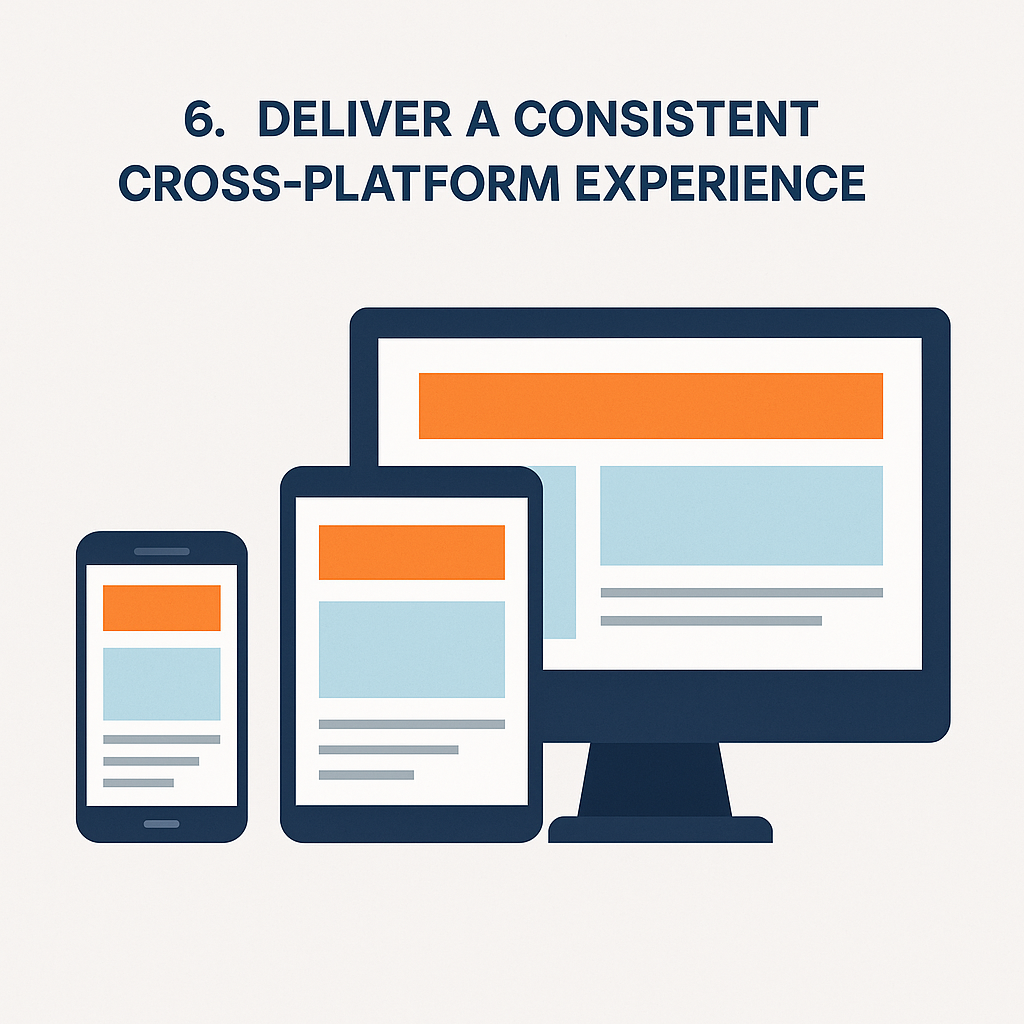
6. Deliver a Consistent Cross-Platform Experience
While optimizing for mobile is essential, you should never sacrifice usability on larger screens. A good responsive design ensures functional parity across devices. Users switching from phone to tablet to desktop should feel at home with your interface, regardless of screen size.
Consistency builds trust and ensures your site feels professional and reliable. Maintain core functionality and branding across platforms while adapting layout and content for each form factor.
Conclusion
A mobile-first design philosophy is no longer optional—it’s a requirement for businesses that want to thrive in the modern digital marketplace. By embracing the six principles above, you can create a fast, intuitive, and scalable website that meets the needs of today’s on-the-go audiences.
Whether you’re targeting Indian mobile users or reaching global audiences, a mobile-first approach will improve engagement, boost SEO, and help you stand out in an increasingly competitive environment.
Need help implementing a mobile-first website?
Contact GreyBath Technology or email us at contact@greybath.com.
Sources & References
- Statista – Global Mobile Website Traffic Statistics
- Google Search Central – Mobile-Friendly Site Guidelines
- Think with Google – Why Mobile Speed Matters
- W3C – Mobile Web Best Practices
- HubSpot – Mobile Website Design: Best Practices